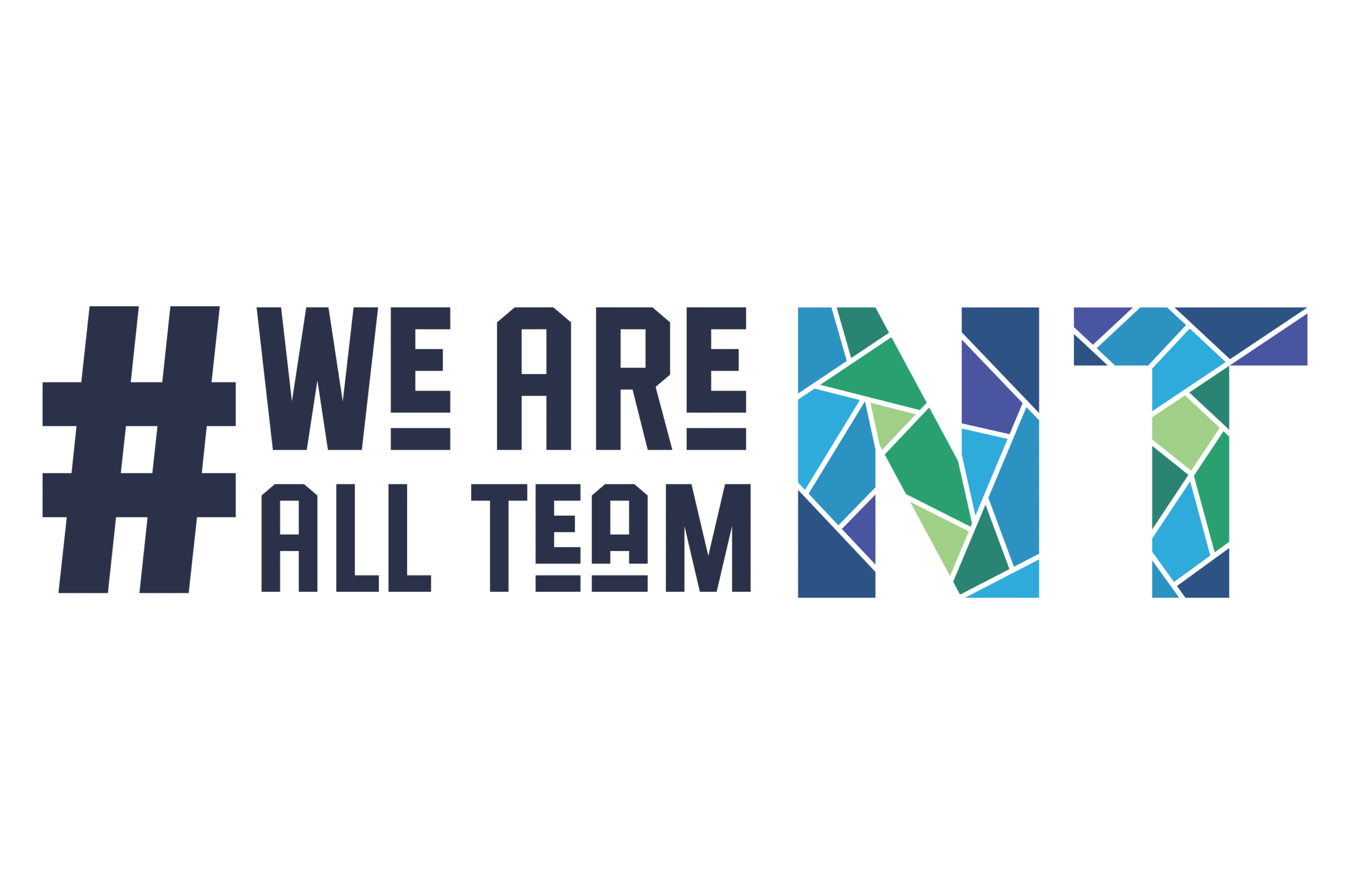
The #WeAreAllTeamNT logo is more than just a design, it’s a powerful representation of unity, support, and northern identity. At its heart, the hashtag symbolizes community and connection. It encourages us to share the stories of the many people behind the scenes, parents, coaches, volunteers, teachers, zamboni drivers, recreation staff, and more, who play an essential role in supporting Team NT athletes at every step of their journey
The vibrant mosaic-style “NT” reflects the incredible diversity and inclusion that define the Northwest Territories. Each colourful shape represents a different person, community, or perspective, all coming together to form something strong, united, and beautiful. It reminds us that when we work together, support each other, and embrace our differences, we create something far greater than the sum of its parts.
The colours within the mosaic are inspired by the natural beauty of the Northwest Territories, from the stunning blues of our lakes and rivers, to the green of our forests, to the deep hues of our night skies, and the magical glow of the aurora borealis. Framing it all is the white outline, symbolizing clarity, identity, and resilience. Much like the snow that blankets and connects the land across the North, this outline brings all the pieces of the mosaic together, a visual metaphor for how our communities unite around a common goal: to uplift and support our athletes.
#WeAreAllTeamNT is a reminder that every coach, volunteer, supporter, family and friends, matter. Together, we create the foundation on which our athletes grow, thrive, and represent the North with pride.