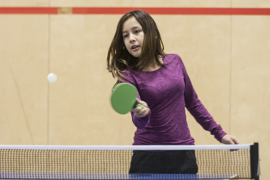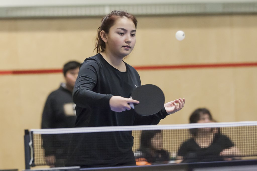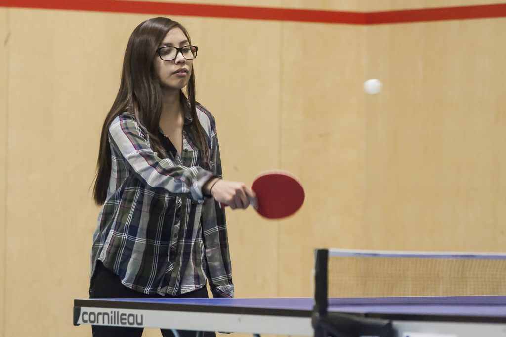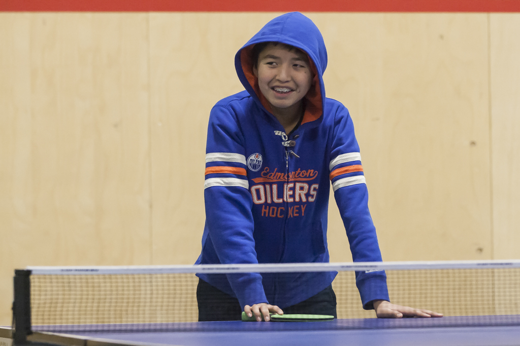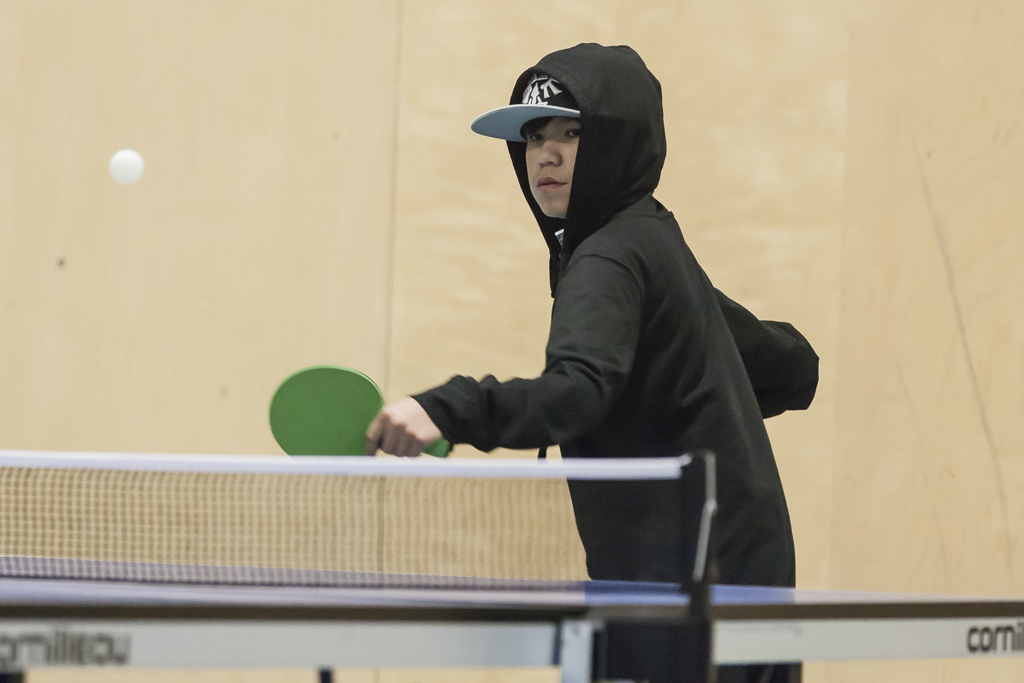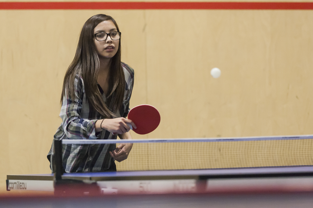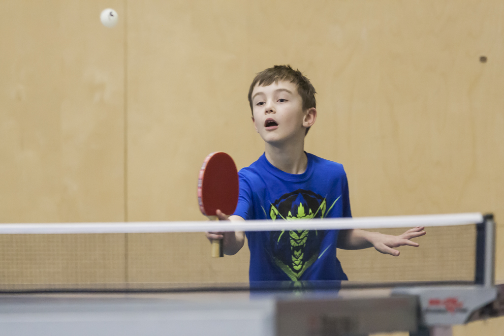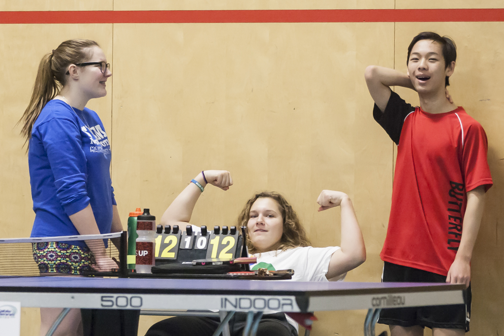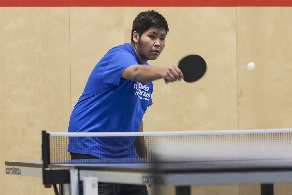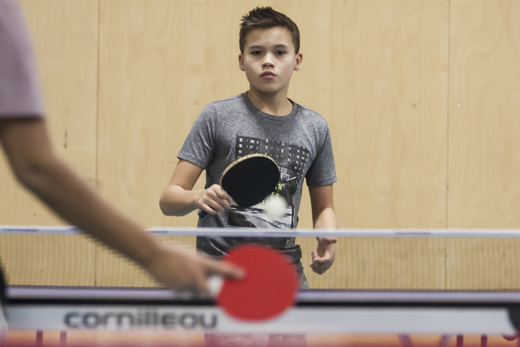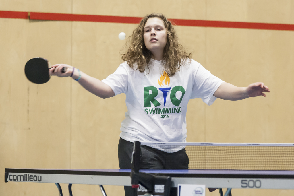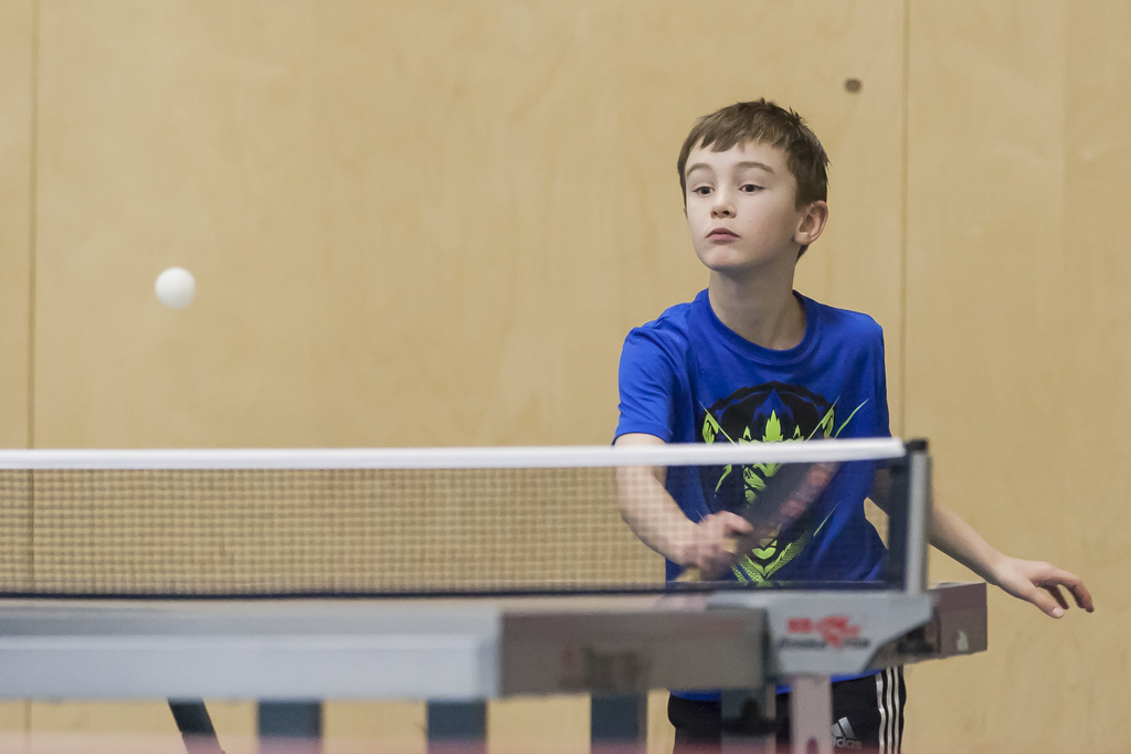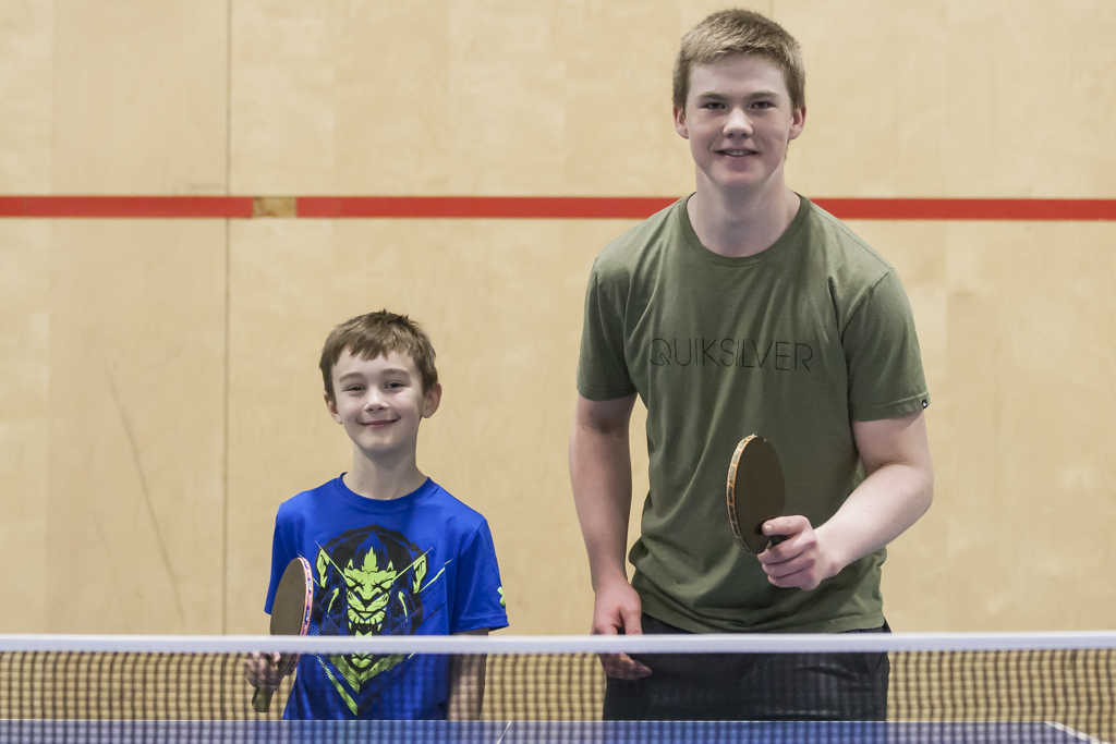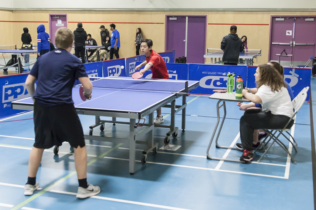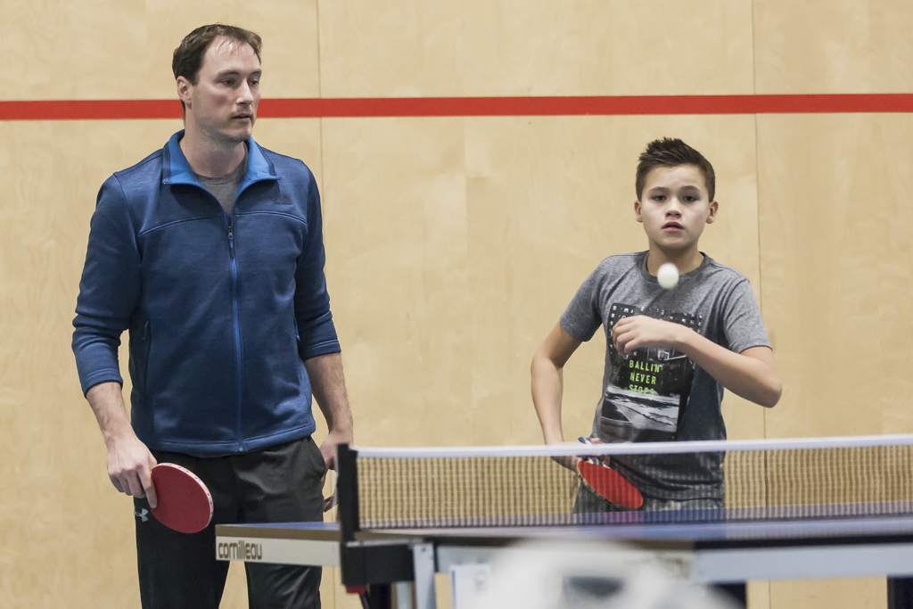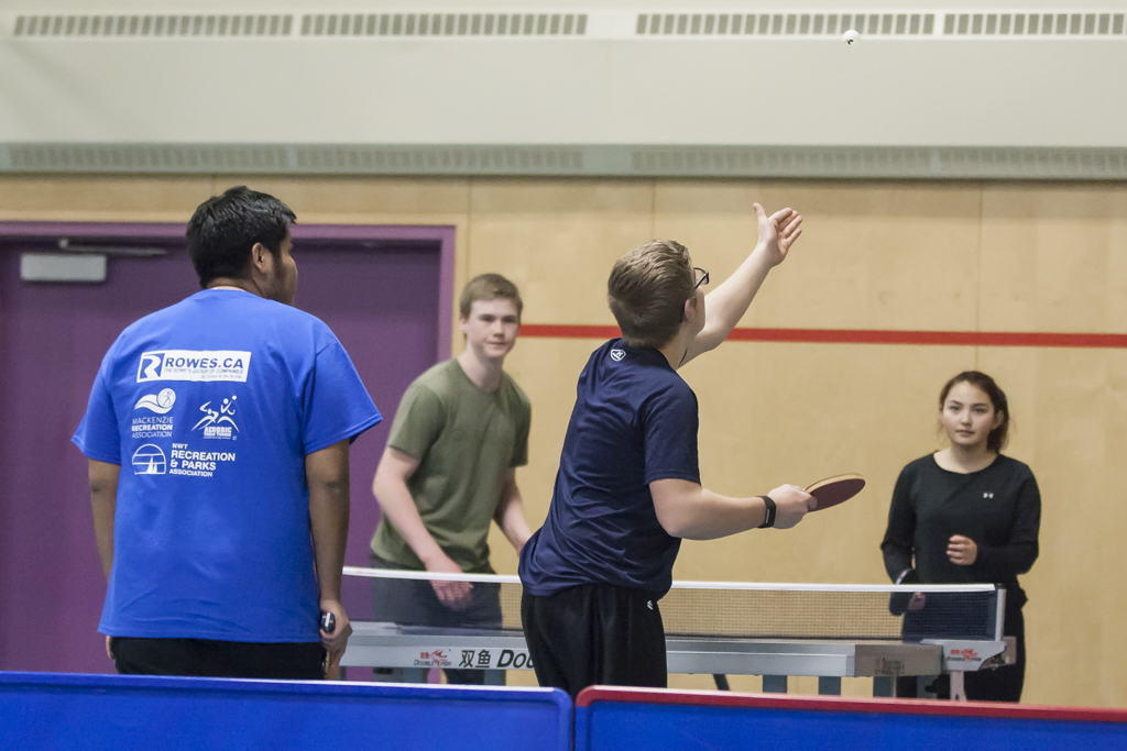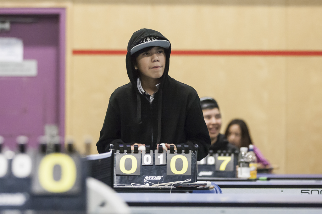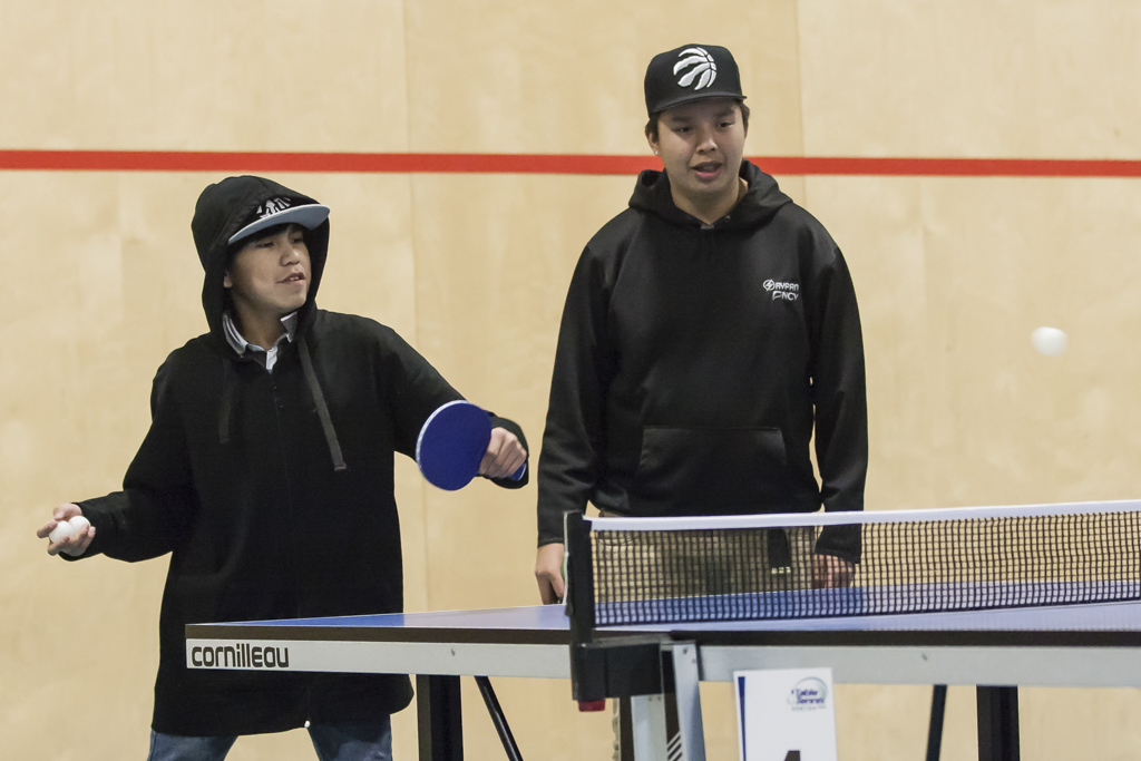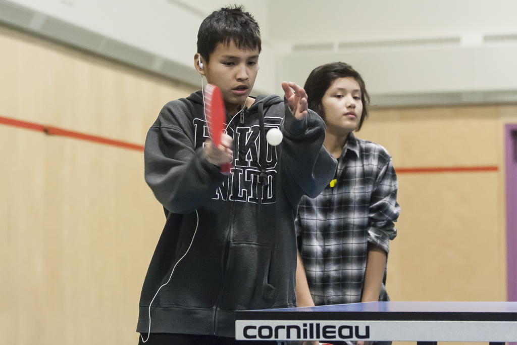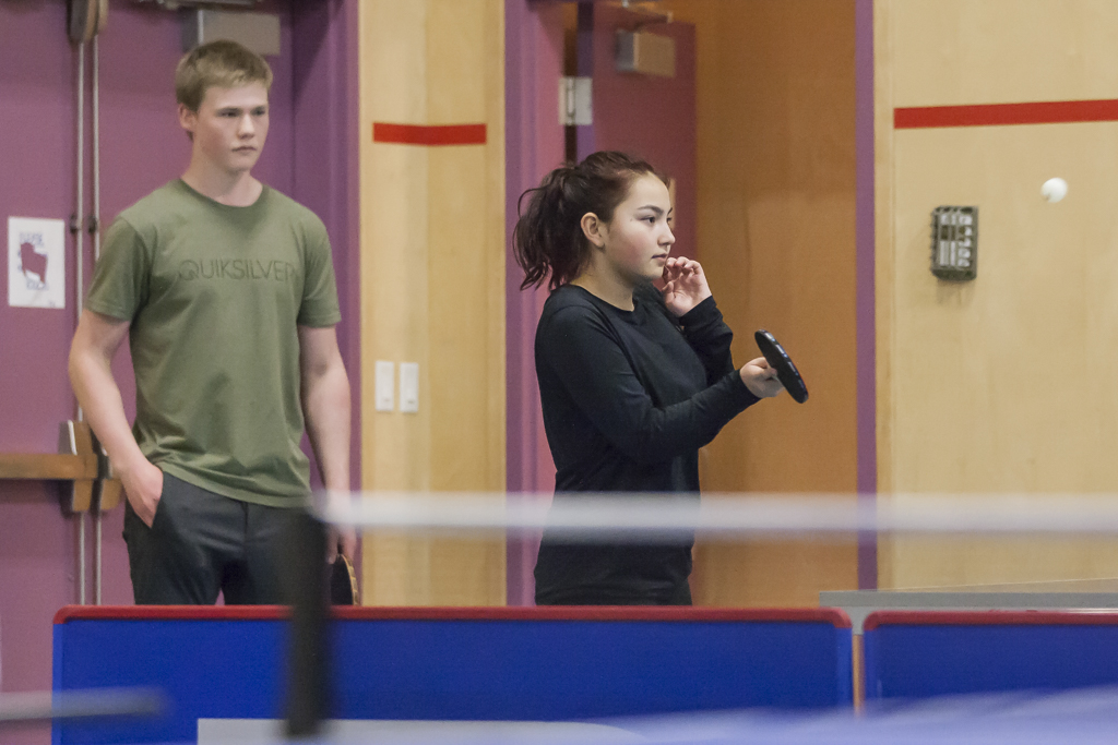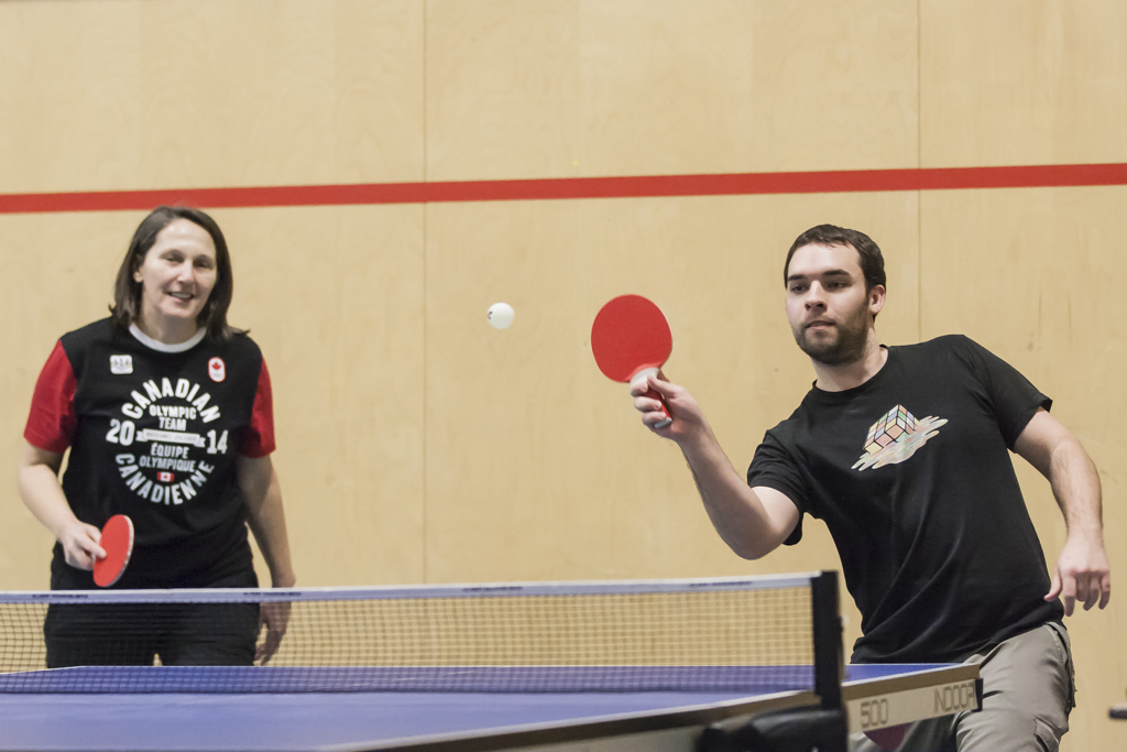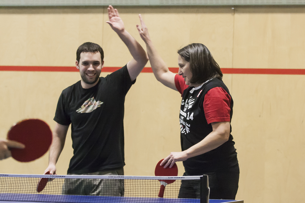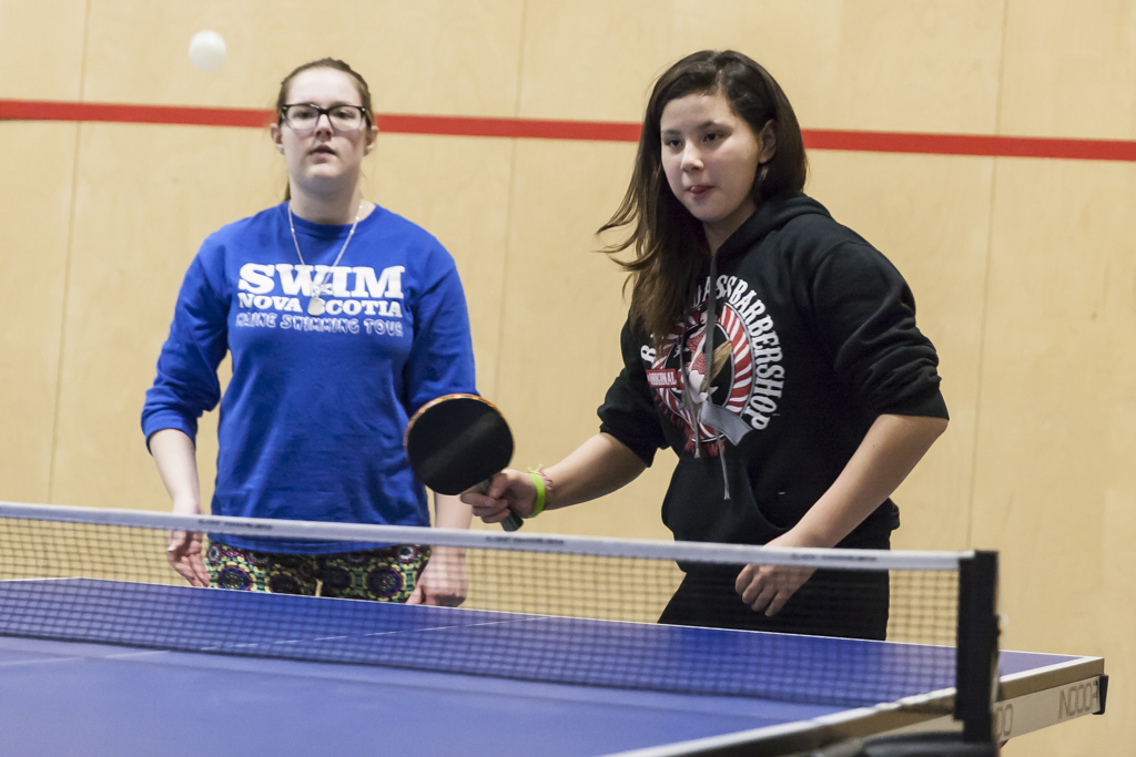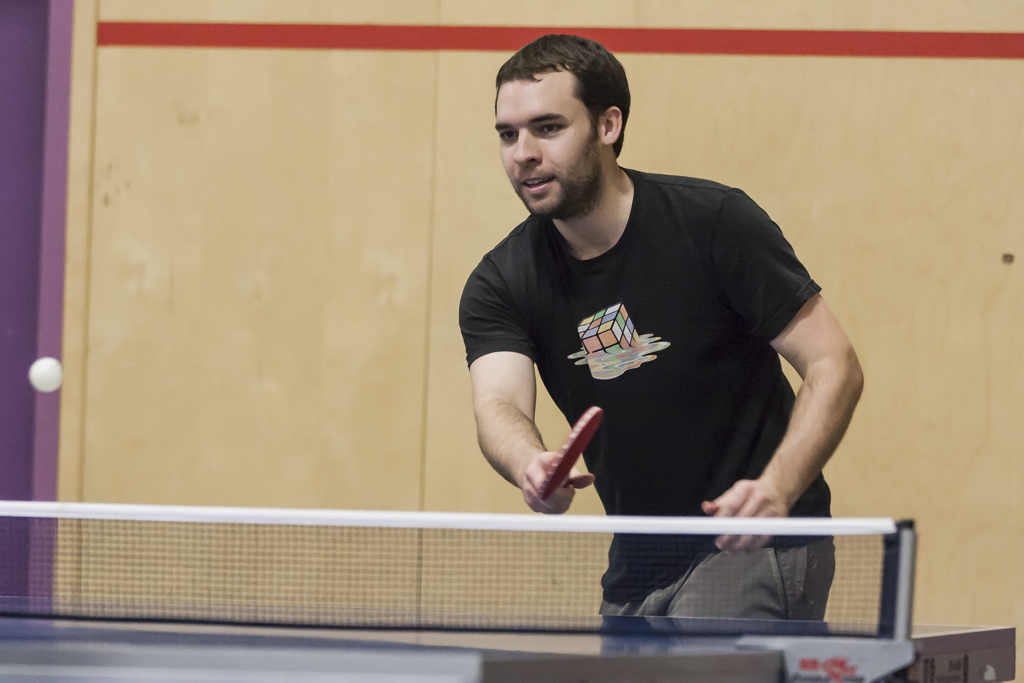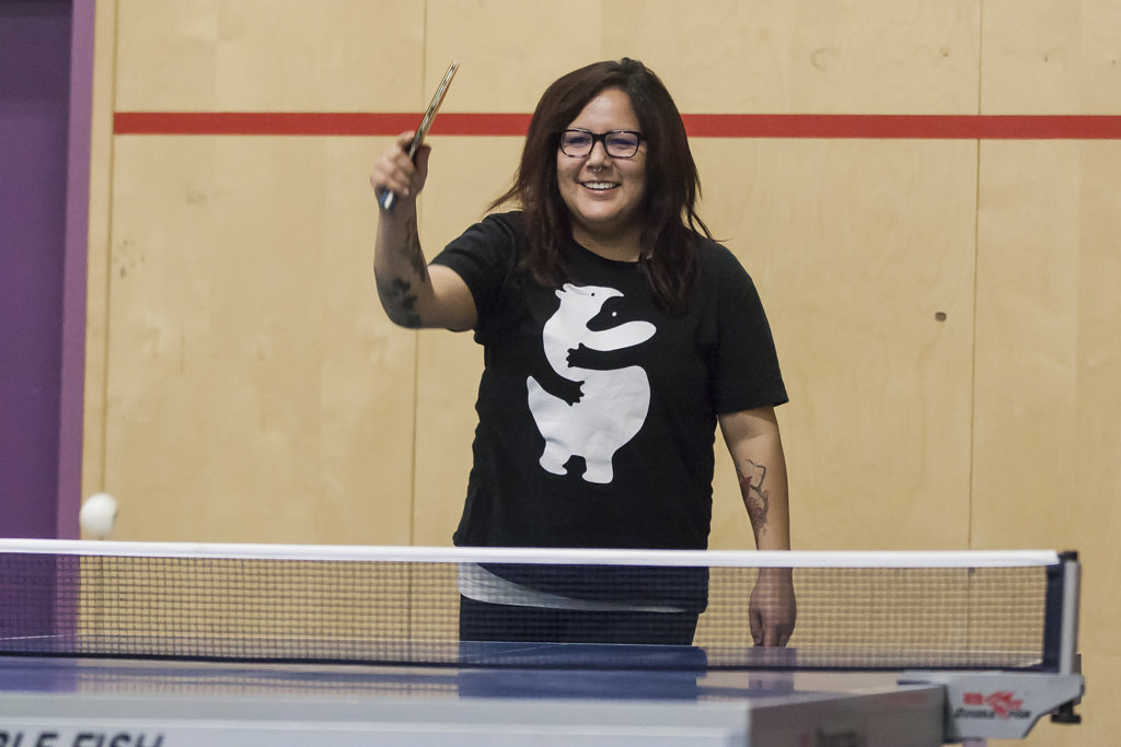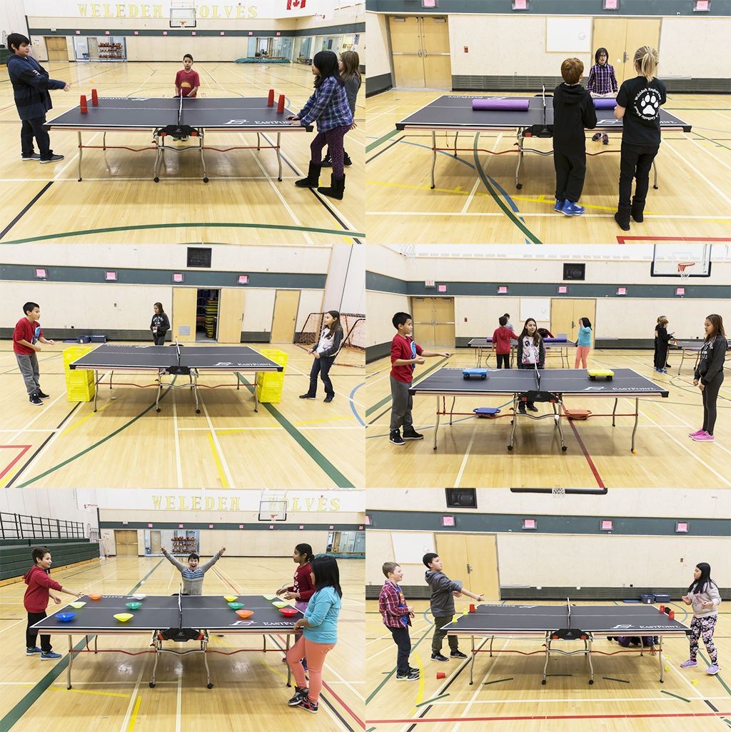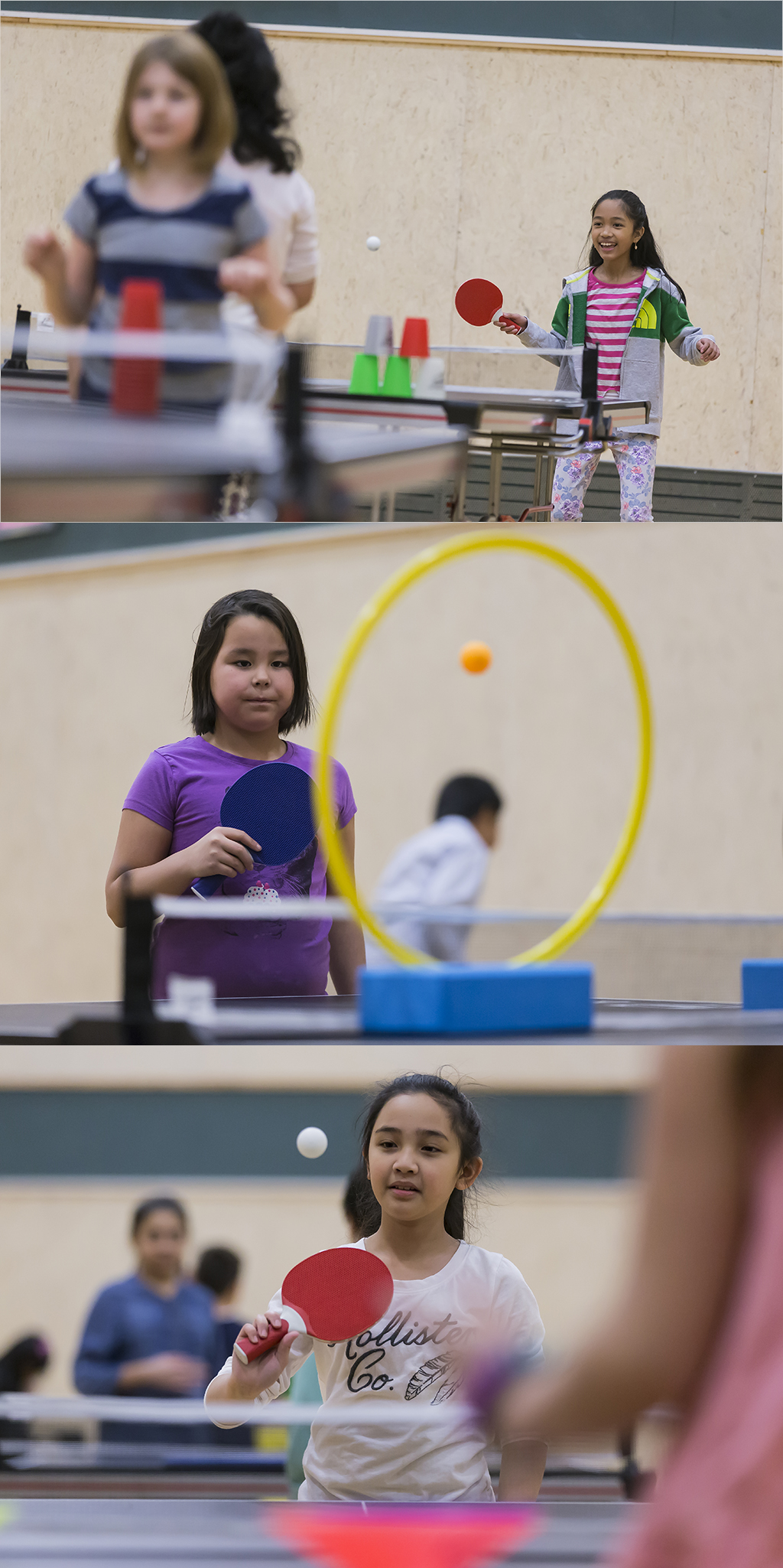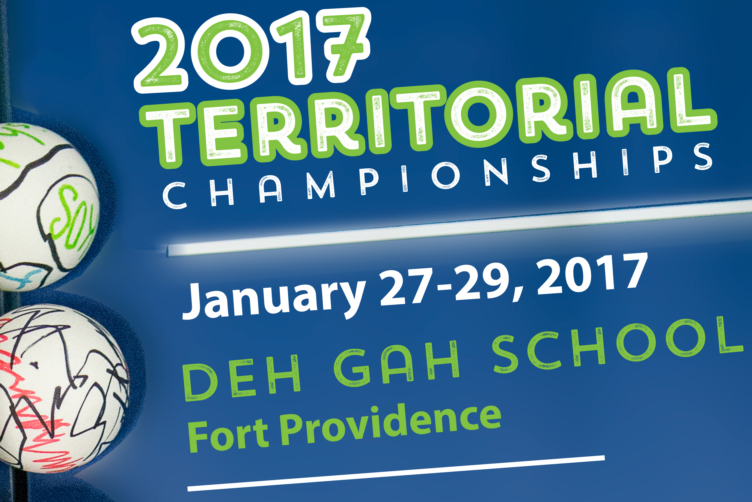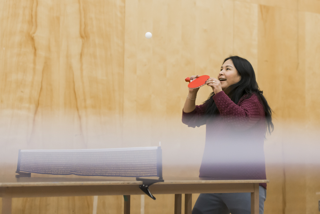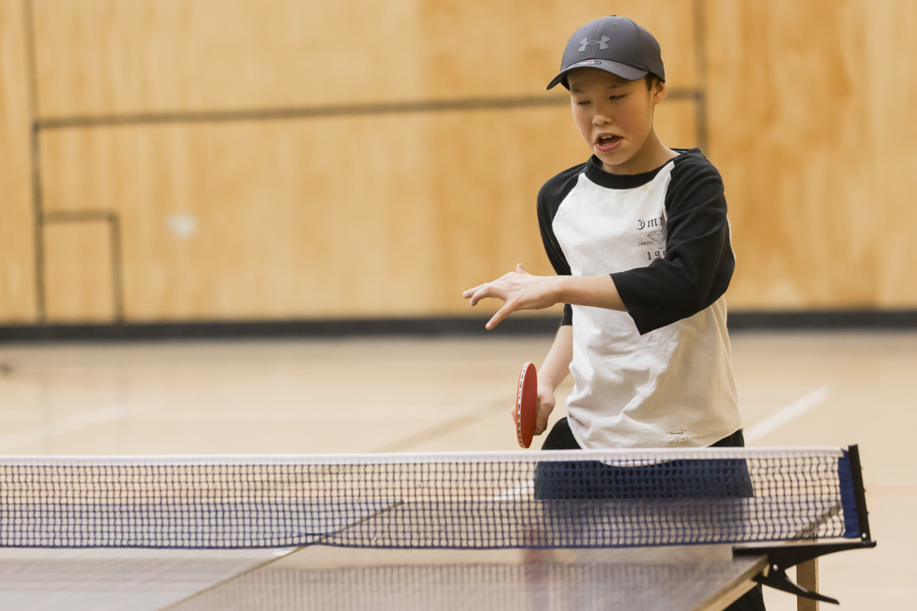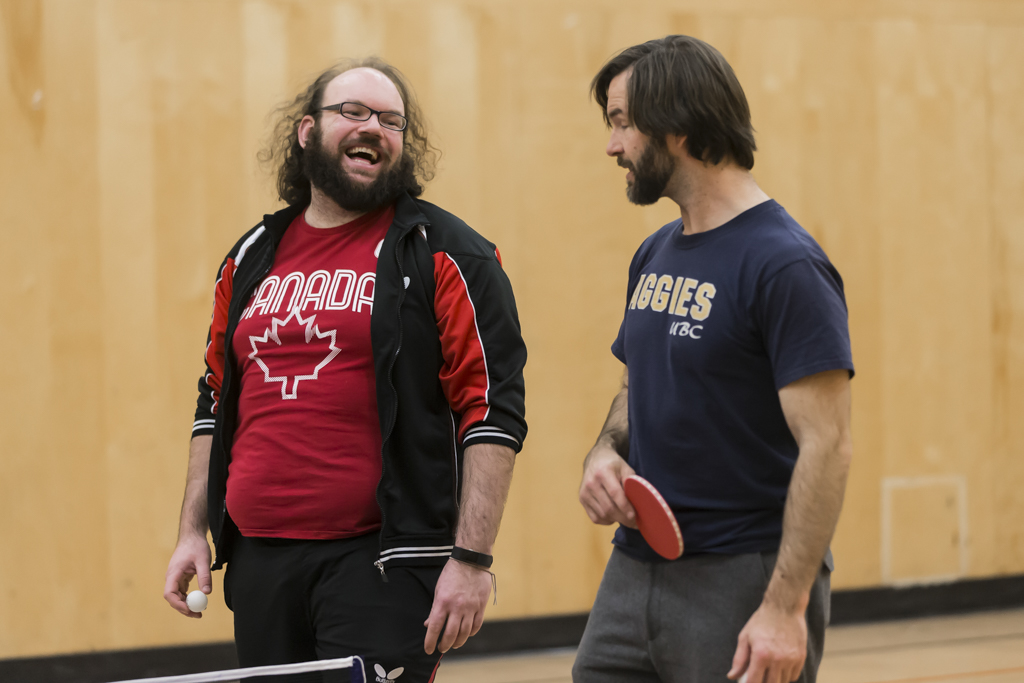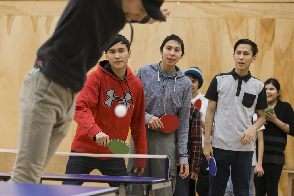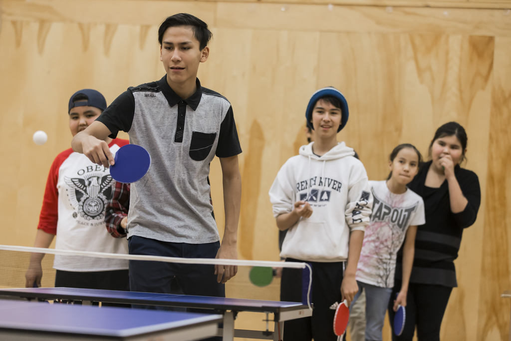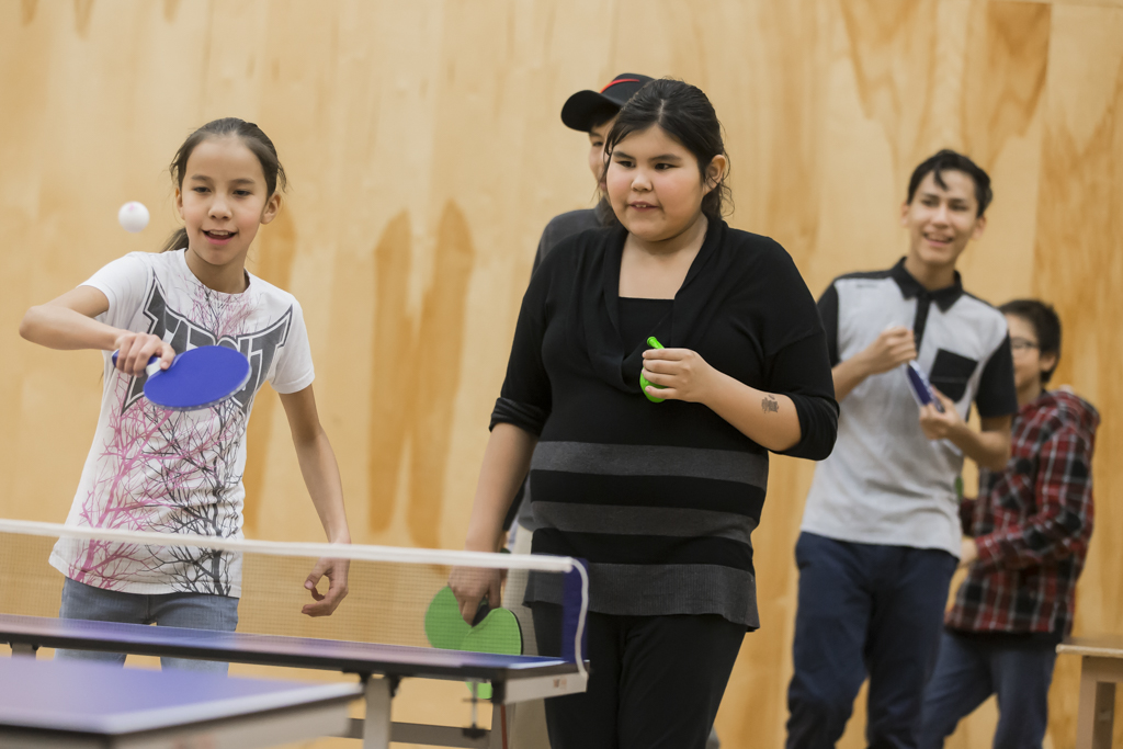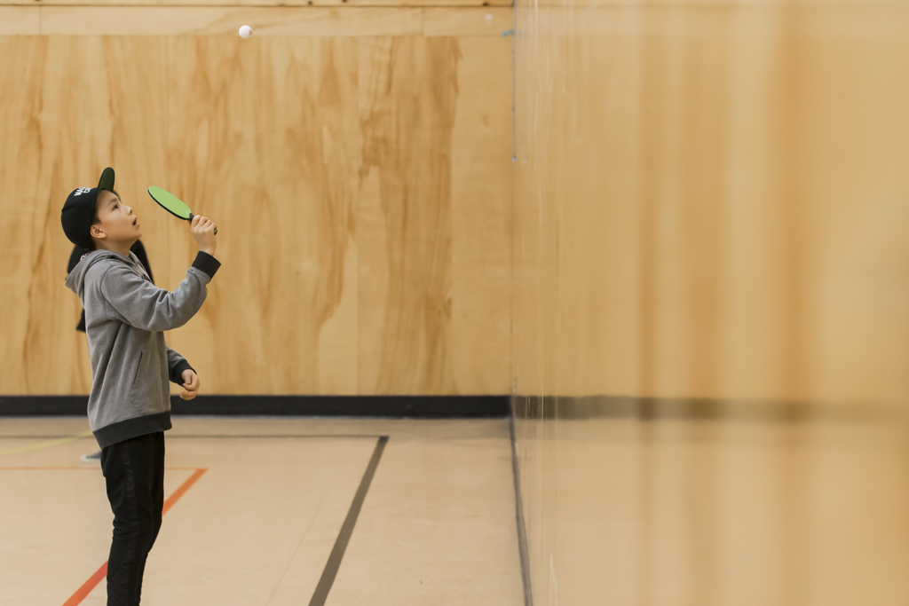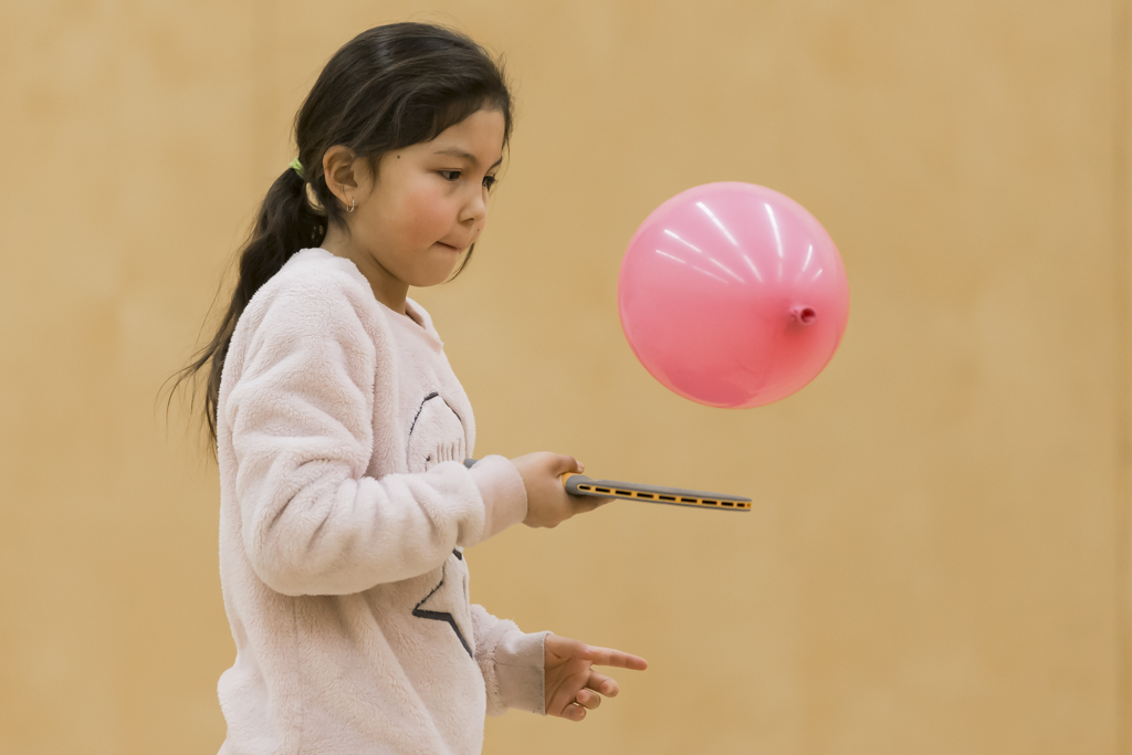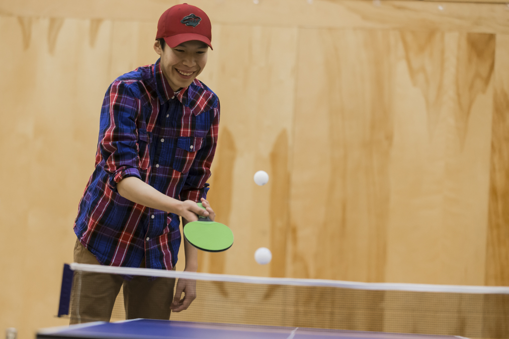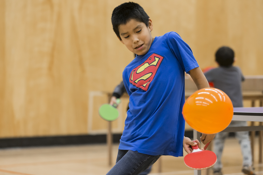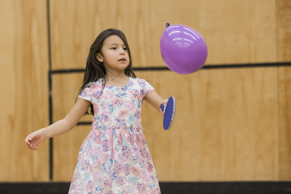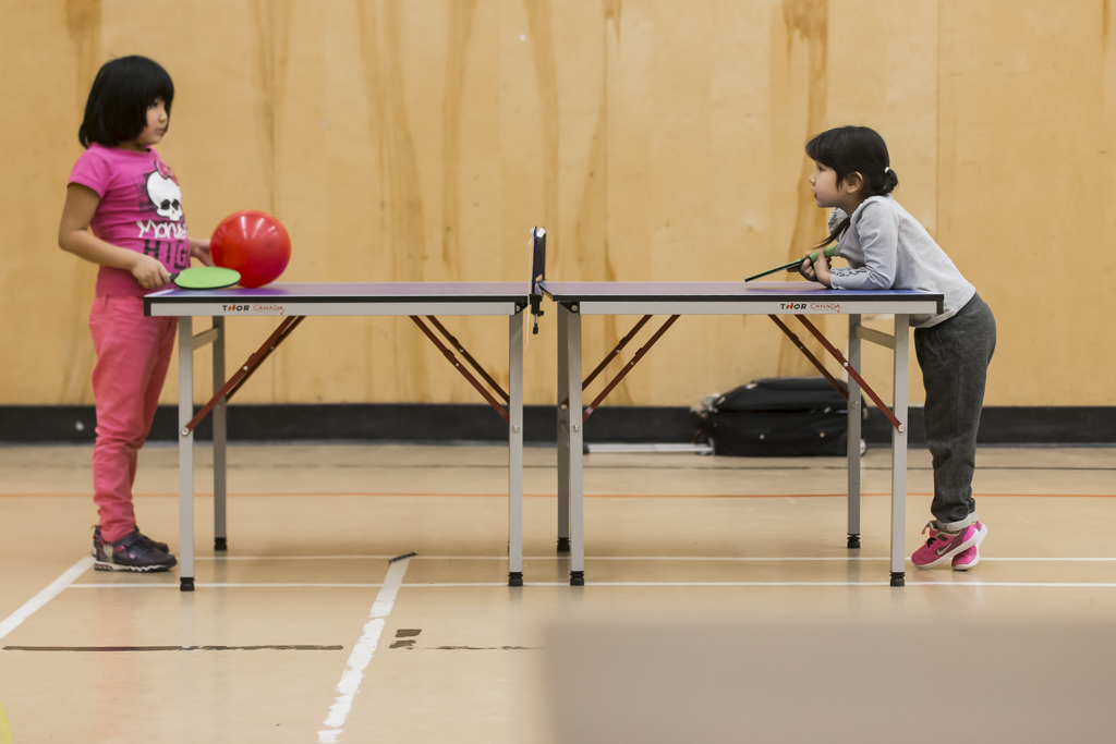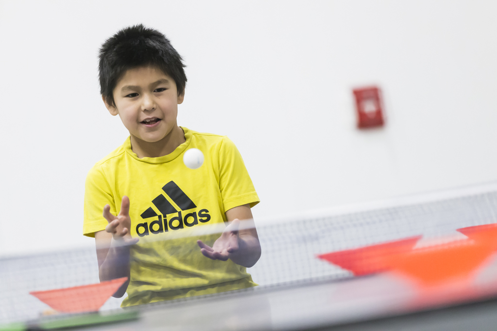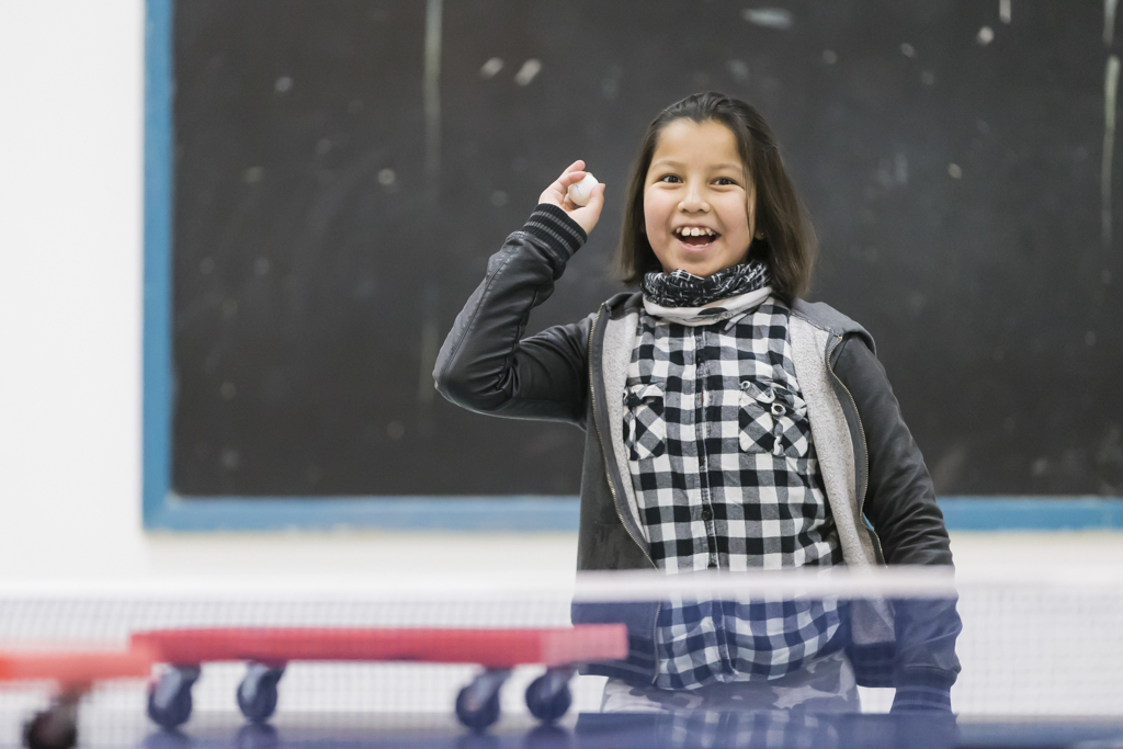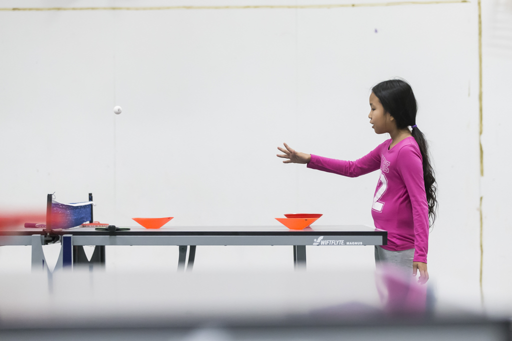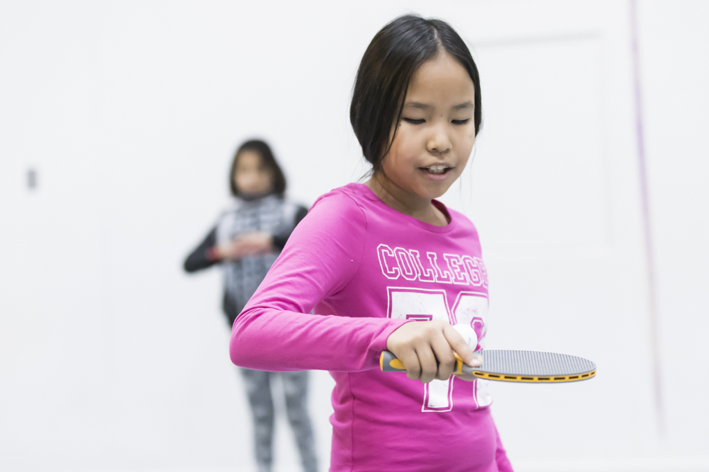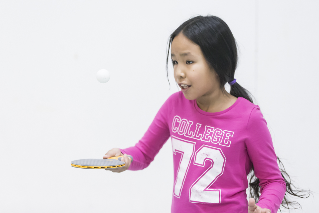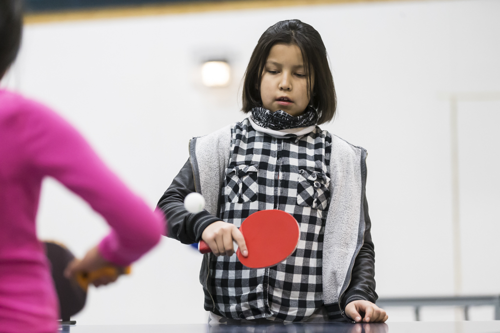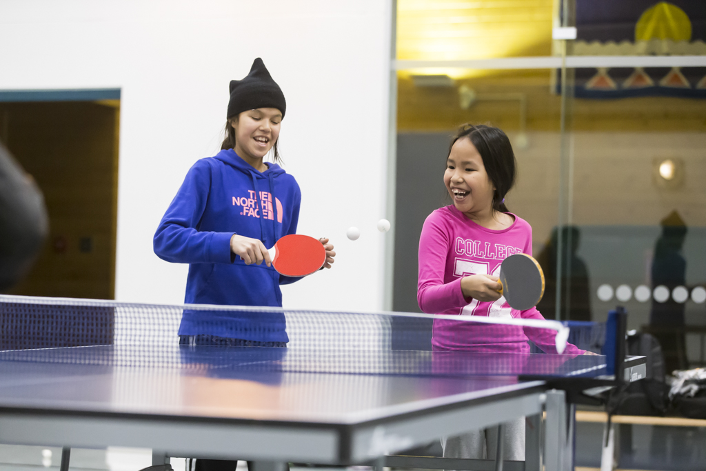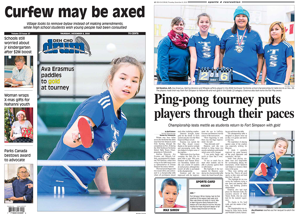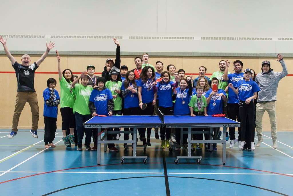
Deh Gah School in Fort Providence hosted the 2017 Territorial Table Tennis Championships. A two day event featuring different age groups, singles and double events from January 27th to 28th.
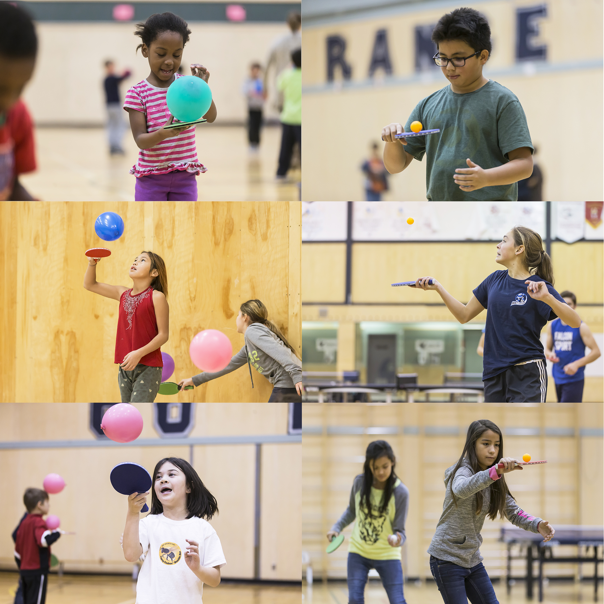
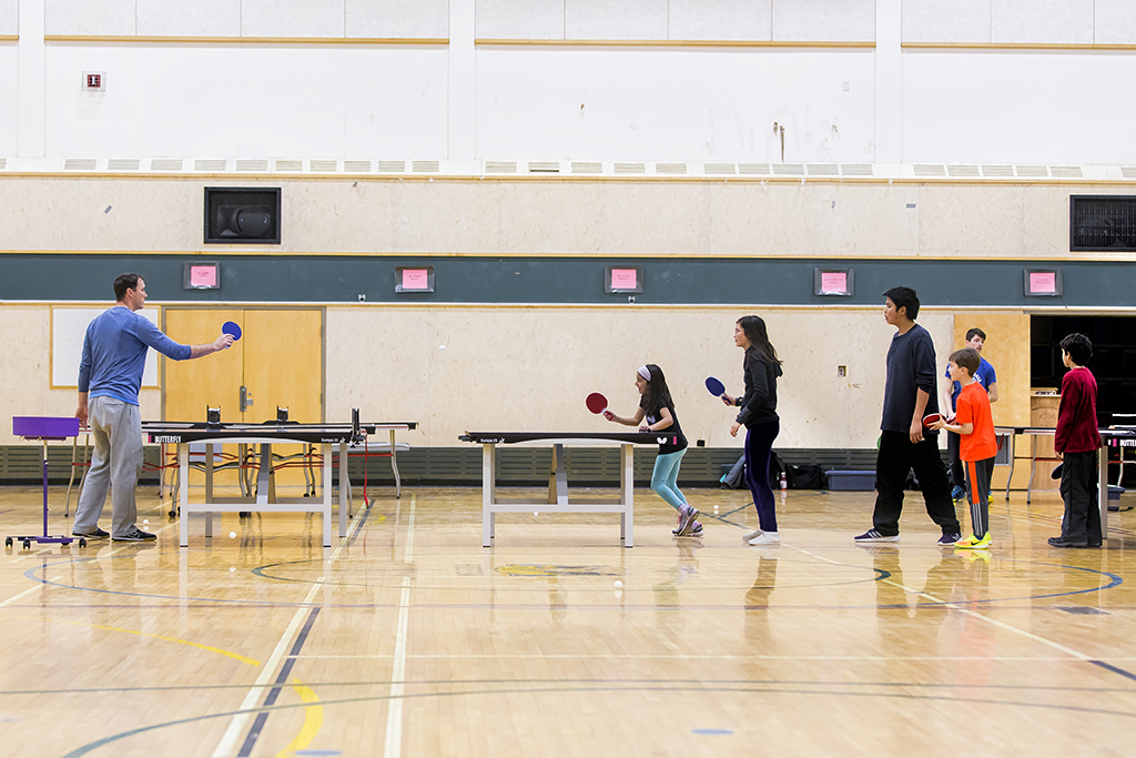
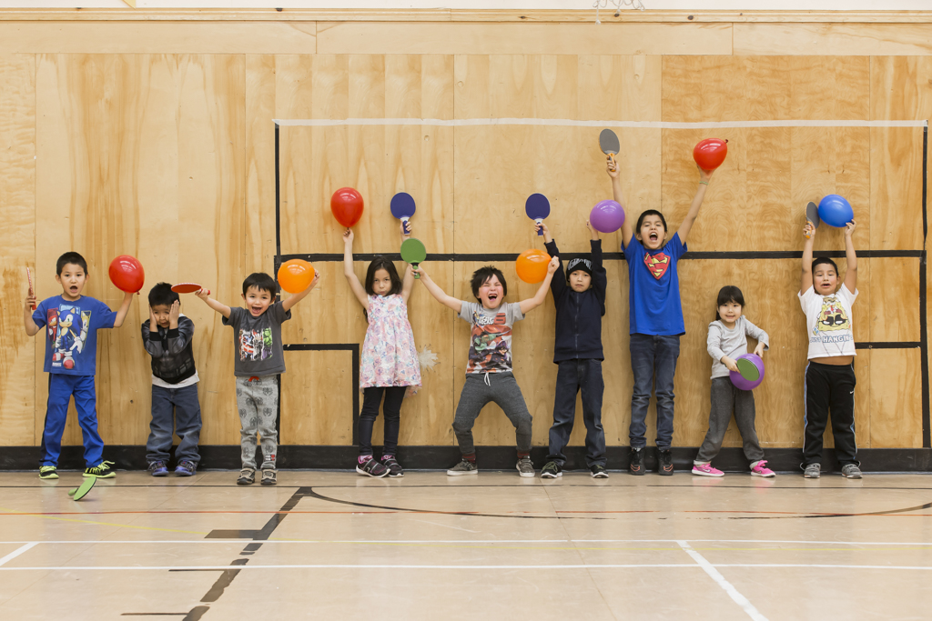
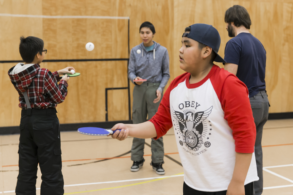
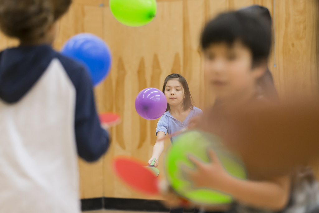
“This was an amazing event, a huge success! We are a very young Territorial Sports Organization still and competing with sports like Hockey, Volleyball, Soccer and Basketball in the Northwest Territories. BUT, we are getting out there, one day at a time and one kid at a time. Really, this was amazing!!!” says Executive Director Thor Gohl. He continous with a smile on his face “Even when there was no matches to be played or umpired, the kids found a free table to play. That says it all!!”
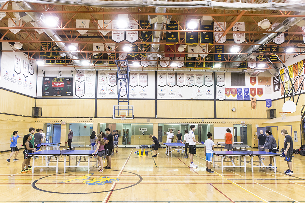
The tournament is definitely growing. From three Regions and four communities, to four regions and seven communities. Participants came from Yellowknife, N’Dilo, Fort Resolution, Hay River, Fort Providence, Fort Simpson and Tulita. We also split the School Championships from the Open Championships, so we have two tournaments a year in two different communities.
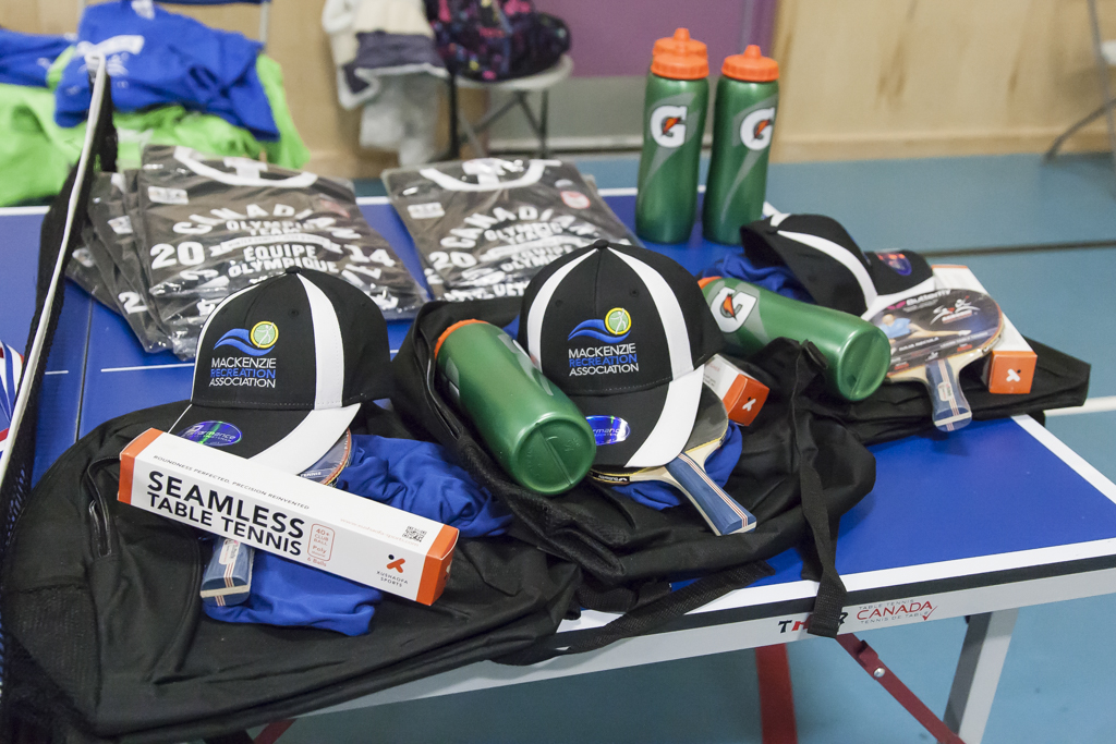
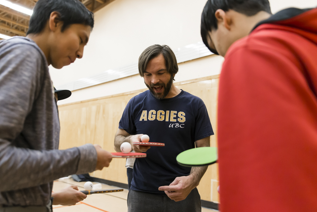
A huge thank you to all our sponsors and partners, without you, this would not be possible. Therefore, a big MAHSI CHO to the Mackenzie Recreation Association, Aerobic Table Tennis, Rowe’s Group of Companies, Butterfly North America and Deh Gah School.
All awards received a Mackenzie Recreation Association package with backpack, hat, and t-shirt. They also received t-shirts from Olympic Team Canada and professional Table Tennis rackets from Steve Rowe’s Aerobic Table Tennis.
A great weekend of play and competitions!!
Here are the results:
Men’s Open: 1. Jeremy Kielstra (N’Dilo) 2. Mike Mathison (Yellowknife) 3. Robert Heath (Fort Resolution)
Women’s Open: 1. Shirley Zhang (Yellowknife) 2. Teresa Vandell (Fort Providence) 3. Slavica Jovic (Yellowknife)
Open Double: 1. David Sangris / Jeremy Kielstra (both N’Dilo) 2. Riis Schaub (Hay River) / Christopher Canadien (Fort Providence) 3. Zachary Mathison / Shirley Zhang (both Yellowknife)
Girls Junior (U18): 1. Tamara Jovic (Yellowknife) 2. Aurora Fraser (Yellowknife) 3. Shannon Bonnetrouge (Fort Providence)
Boys Junior (U18): 1. Brian Liang (Yellowknife) 2. Riis Schaub (Hay River) 3. Zack Horton (Hay River)
Girls Cadet (U15): 1. Aurora Fraser (Yellowknife) 2. Shannon Bonnetrouge (Fort Providence) 3. Starr MacLean (Fort Resolution)
Boys Cadet (U15): 1. Zachary Mathison (Yellowknife) 2. David Sangris (N’Dilo) 3. Isaac Bonnetrouge (Fort Providence)
Hopes Girls (U13): 1. Taneisha Franki (N’Dilo)
Hopes Boys (U13): 1. Zachary Mathison (Yellowknife) 2. Jude Simon (Fort Resolution)
Junior Doubles: 1. Jude Simon (Fort Resolution) / Zack Horton (Hay River) 2. Riis Schaub (Hay River) / Chase Yakeleya (Tulita) 3. Adam Nadli (Fort Providence) / Zachary Mathison (Yellowknife)
Zack Horton (Hay River) received the Fair Play award for his amazing attitude. Winning or not winning he was always cheerful. When someone else made an amazing point, he would cheer for them and tell others about it. When there was a free table he would want to play with all different players. Very great to have that kind of energy around.
David Sangris (N’Dilo) received the Most Improved Player award with winning a Silver Medal in the Cadet Boys category and a Gold Medal in the Open Doubles. We have seen much improvement, just during the tournament. He is a dedicated player, coming with the school to Table Tennis clinics and tournaments.
Starr MacLean (Fort Resolution) received the Most Improved Player award and bronze in Cadet Girls category. We were in Fort Resolution recently and we can see fast improvement. When she was not playing in the competition, she was looking for others to play with.